UME:
It’s not magic
Just great design.

UME
Japanese purity meets Scandinavian audacity, and beautiful design emerges. Quite simply, it’s UME.
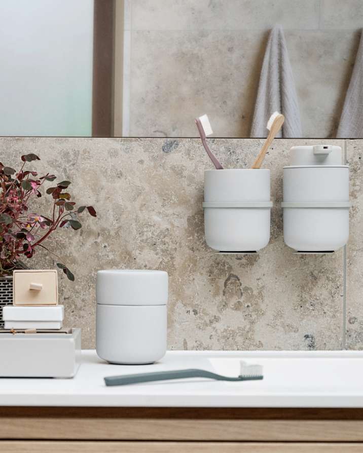
UME is Japanese for plum tree. It symbolises patience and strength, and elegance, too. And you clearly sense that when looking at the range. The U-shape contributes aesthetic calmness and stability. There’s a light-and-airy Nordic feel, too. The products are virtually floating, as if by magic. But it’s not magic. It’s just great design.
The VE2 design team is behind UME. Their work has been recognised with a number of design awards over the years.
We suspect there are more to come.
Our highest ambition is to create a sense of unity. The design must be functionally justified and able to blend in aesthetically with the users’ universe.
The collaboration between VE2 and Zone Denmark is based on shared enthusiasm and great chemistry. And of course on VE2’s ability to design beautiful and functional products perfectly suited to the users.
Hugo Dines Schmidt and Morten Lauritzen have a knack for encouraging the whole team to come up with ideas, then getting to the core and finding the final solution together. That’s why Zone Denmark has celebrated many of its greatest successes with VE2.
UME
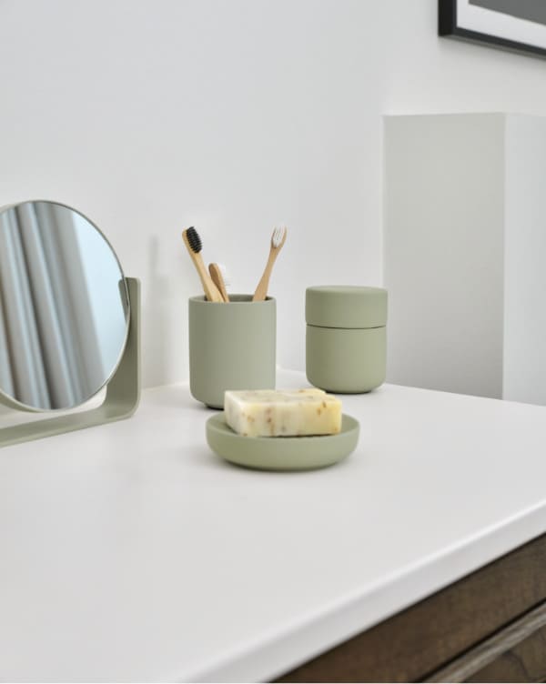
Beauty in the mirror
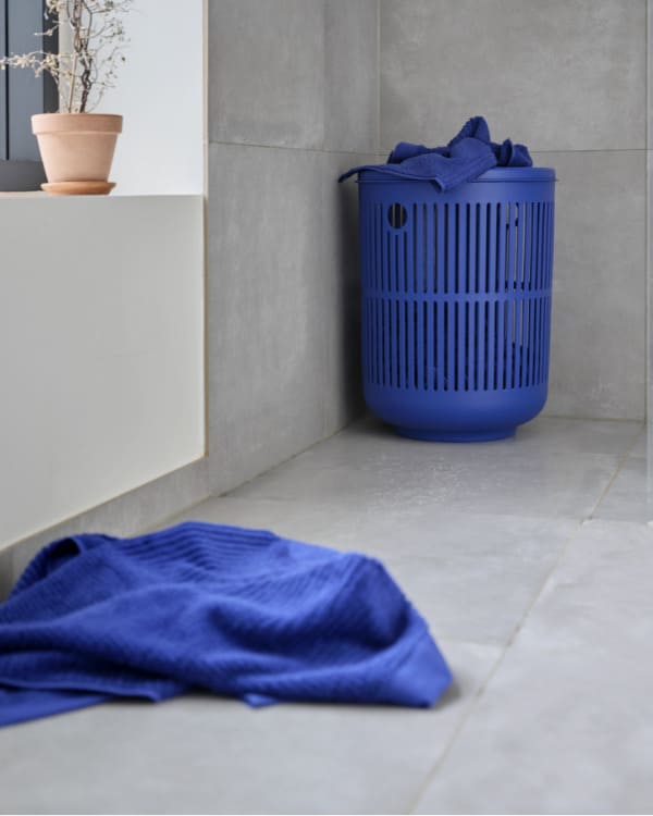
Laundry basket
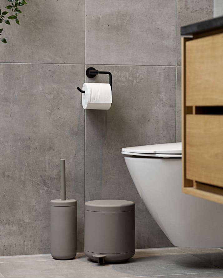
Everybody’s favourite
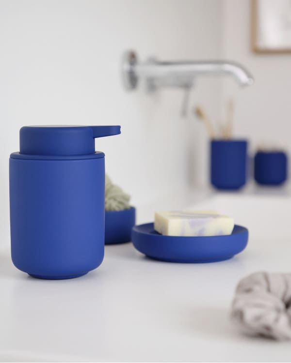
In love with form and function
Clean and cool
